Horror film posters built on tension, not spoilers
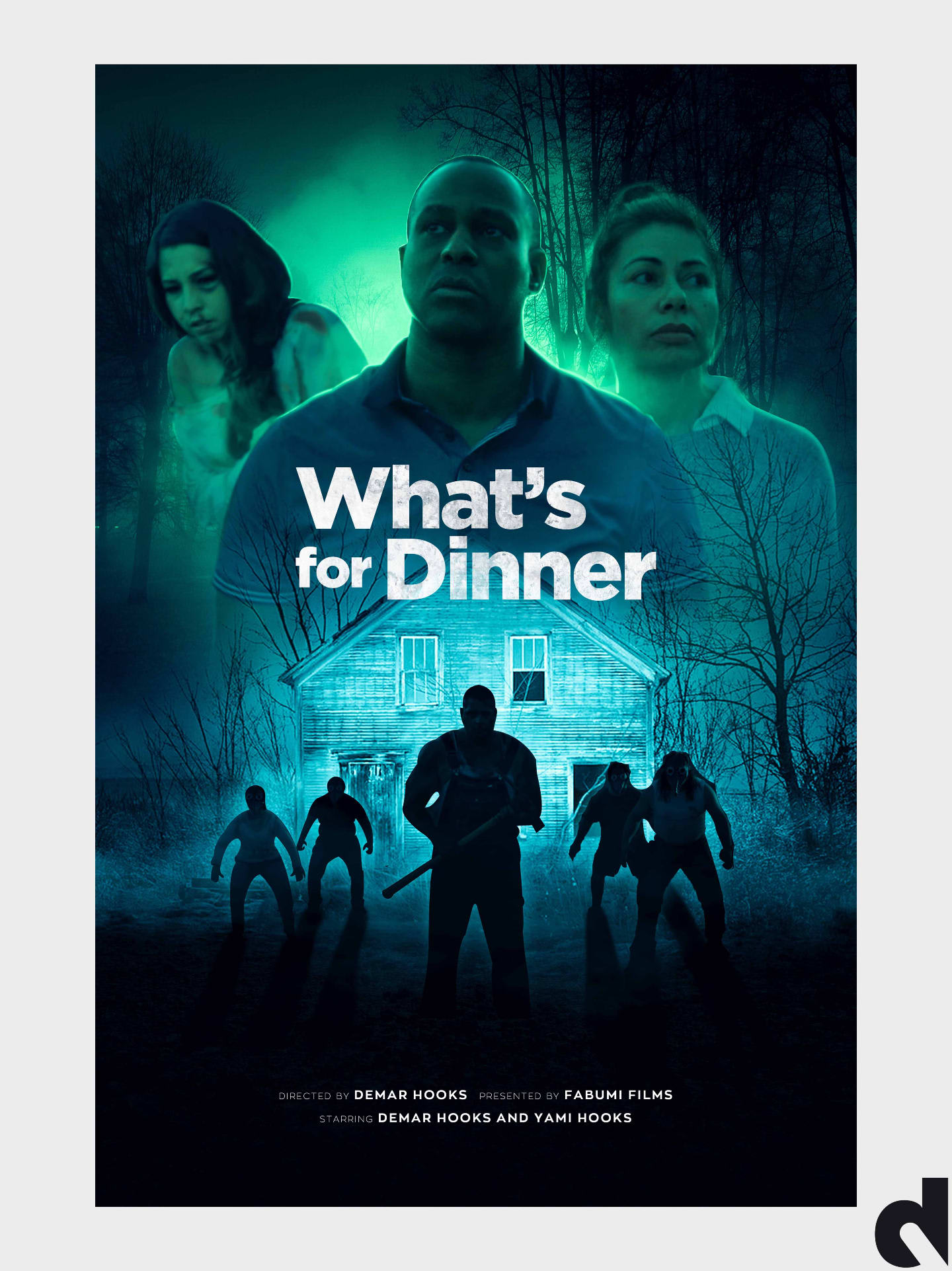
Horror marketing has to unsettle before a viewer reads a single word. We design posters built around tension, silhouette and suggestion — visuals that make an audience want to look away and look closer at the same time.
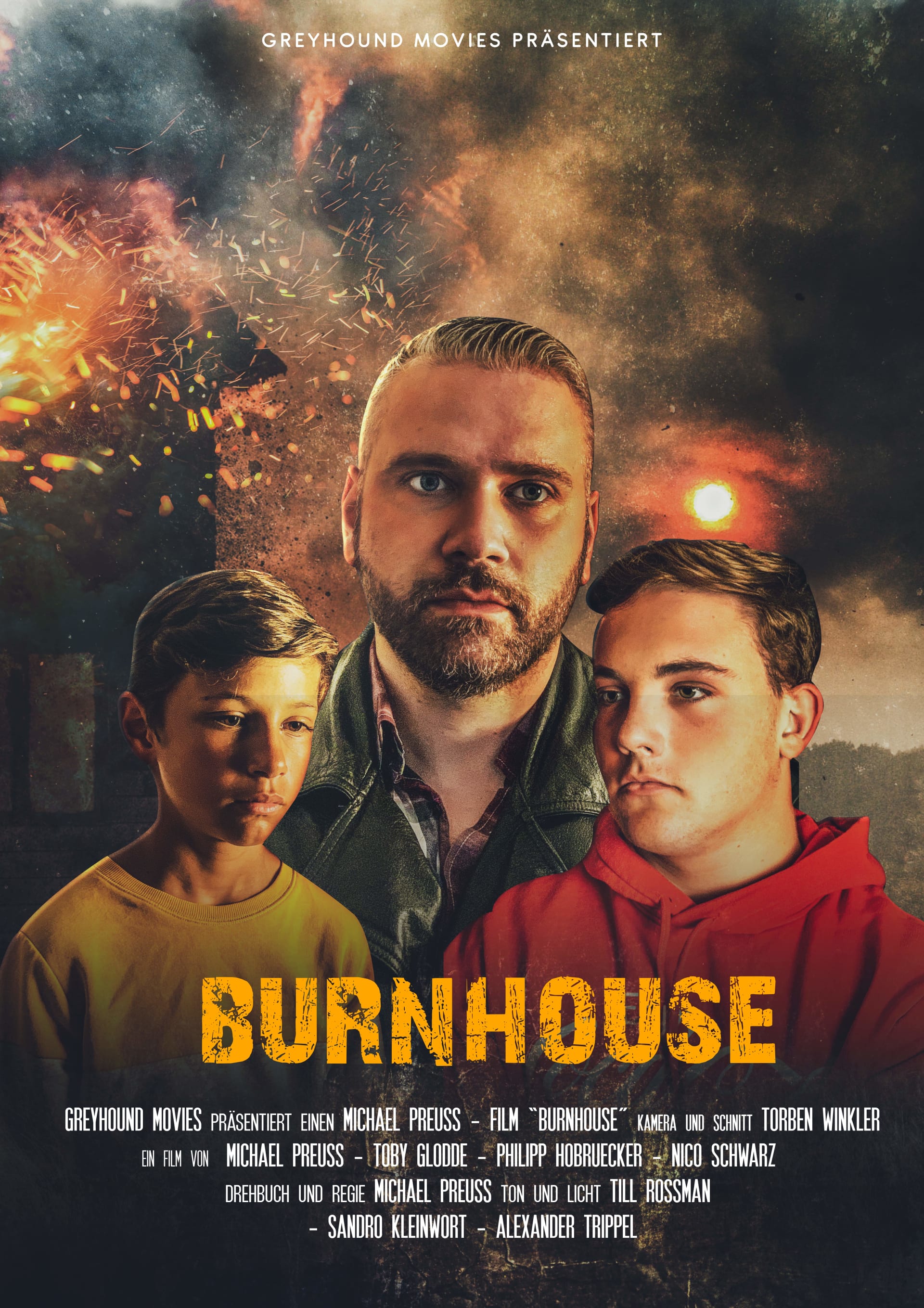
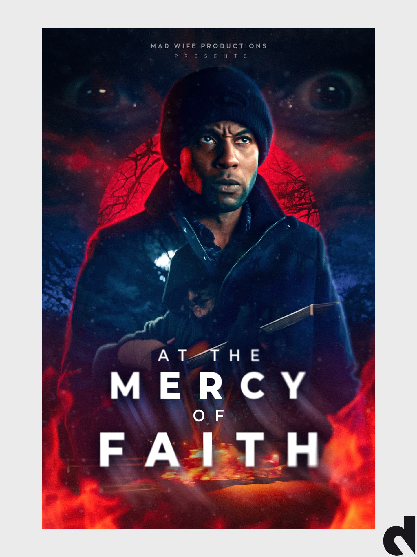
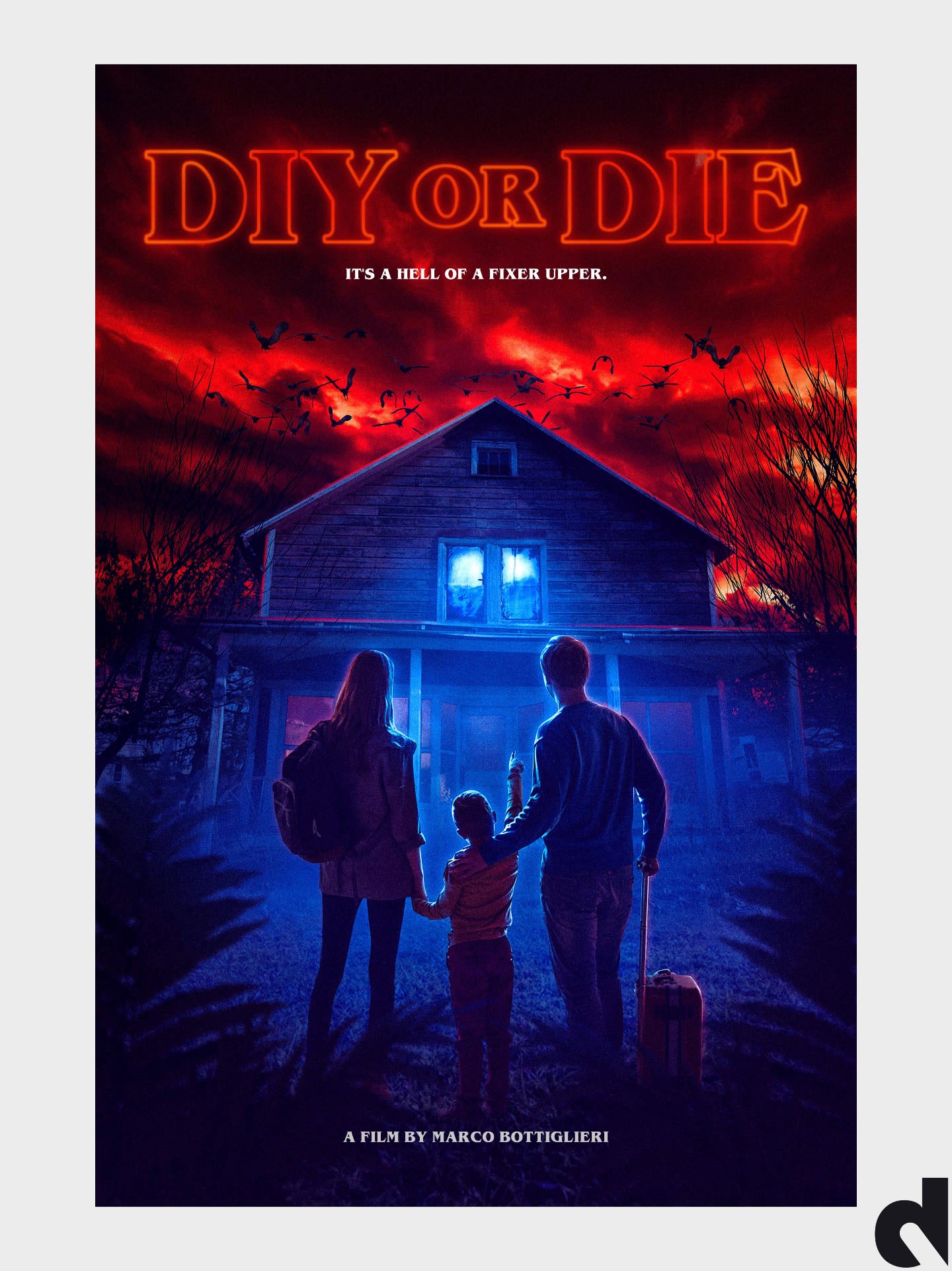
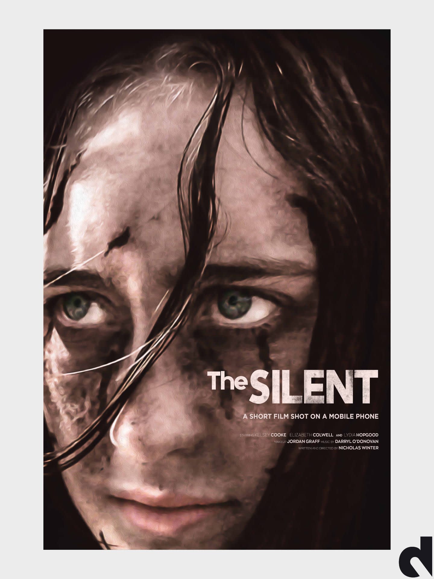
Horror poster design succeeds when it creates dread without explaining the plot. The best one-sheets use shadow, texture and selective detail to imply threat — a figure half-seen, an object slightly wrong, a palette drained of warmth. Audiences decide in seconds whether a horror title feels genuinely unsettling or generic, and key art is what earns that first click on a platform grid.
We design horror key art around the emotional promise of the film: psychological dread, creature feature, folk horror, slasher energy or slow-burn atmosphere. Typography is treated as part of the scare — distressed letterforms, tight cropping and negative space that feels claustrophobic. The goal is artwork that haunts at thumbnail size and rewards a closer look in a cinema lobby.
Drix Agency works with indie horror filmmakers who need festival submissions, streaming launches and social campaigns from a single strong concept. We leave room for laurels when needed, deliver print-accurate files, and refine until the poster matches the film's tone. If your story lives in what is hidden, the poster should hide the right things too.
Horror key art is a system, not a still with a scream font. We lock one unsettling composition, then export the one-sheet, the 1920×1080 tile, and social crops so the festival wall and the platform grid are the same threat. Unlimited revisions continue until the dread is specific — not generic fog.
What makes a horror movie poster work
A horror movie poster works when it creates dread without spoiling the scare. The thumbnail has to feel wrong in a specific way: a figure half-seen, an object slightly off, a palette drained of warmth. Gore as the only idea dies on a platform grid. Suggestion survives compression and still haunts a lobby wall.
We design around the emotional promise — psychological dread, folk horror, creature, slasher energy, or slow burn — not around a plot dump. Typography is part of the scare: tight tracking, distressed letterforms, or quiet type that makes the image louder. Negative space should feel claustrophobic, not empty. The one-sheet and the 16:9 tile must carry the same dread or the campaign splits in two.
If you only have a few stills, we will hide the right things. The poster should match what the film withholds. That is how indie horror competes with studio titles that bought a bigger creature.
Festival-ready horror key art and campaign crops
Horror festival posters need print-accurate 27×40 files and a composition that can carry laurels after official selection. We also cut 16:9 and social crops from the same key art so the Instagram scare and the screening poster are the same film. First concepts typically land in 24–48 hours; revisions stay open until you approve.
Send tone references, what must never be shown, and your submission date. A tight deadline is a real brief. A vague “make it scary” is not. Browse related thriller and sci-fi pages if your film sits on a genre border — the poster should pick a lane the thumbnail can keep.
A horror brief should also say whether the scare is sound, implication, or a creature you can show. If the creature is not ready, we design around absence. If a festival forbids certain imagery, tell us before the first composite. Print-ready 27×40 files and 16:9 tiles come from one key art direction so the lobby and the platform are the same film.
Explore our film festival poster design, movie poster design for indie filmmakers, and key art design service, or browse more thriller poster design, sci-fi poster design and drama poster design.
Process
- 01 Discover. We review your film, audience, references, release platform and visual objectives.
- 02 Concept. We develop distinctive creative directions that communicate the strongest selling idea.
- 03 Refine. We sharpen composition, typography, color and details through collaborative feedback.
- 04 Deliver. You receive organized, high-resolution files prepared for every required format.
First concepts typically arrive in 24–48 hours. See the full movie poster design process.
Typical deliverables
- ✓ Print-ready US 27×40 one-sheet at 300 DPI
- ✓ High-resolution digital master
- ✓ Streaming 1920×1080 crop when the campaign needs it
- ✓ Social crops and space for festival laurels when scoped
Horror poster questions
What is included in horror movie poster design?
A horror poster package from Drix typically includes a print-ready US one-sheet, a high-resolution digital master, and campaign crops when you need streaming or social. First concepts usually arrive in 24–48 hours with unlimited revisions until approval.
How do you make horror key art work at thumbnail size?
Horror key art has to read in about a second on a platform grid. We lock one focal point — face, silhouette or object — and test type at roughly 200 pixels wide before the print lock.
Do you design horror posters for indie films and festivals?
Yes. Independent horror films and festival submissions are a core brief. We leave space for laurels and deliver print-accurate 27×40 files plus the digital size your portal requires.
What should I send for a horror poster quote?
Logline, the horror tone you want, deadline, cleared stills, and three reference posters. If the cut is still moving, say so. Email info@drix.agency or use the contact form — no minimum budget.
Can horror artwork be adapted for streaming and social?
Yes. We treat the horror one-sheet as one crop of the key art system so 1920×1080, 1080×1080 and 1080×1920 still feel like the same film.
Is this official studio horror campaign art?
Portfolio pages document artwork made by Drix Agency. Official production company, distributor or IMDb credits are published only when we have clearance. Titles that resemble known franchises are not a claim of an official studio commission unless the page says so.